The Birth of MORA
A Journey of Tradition and Taste

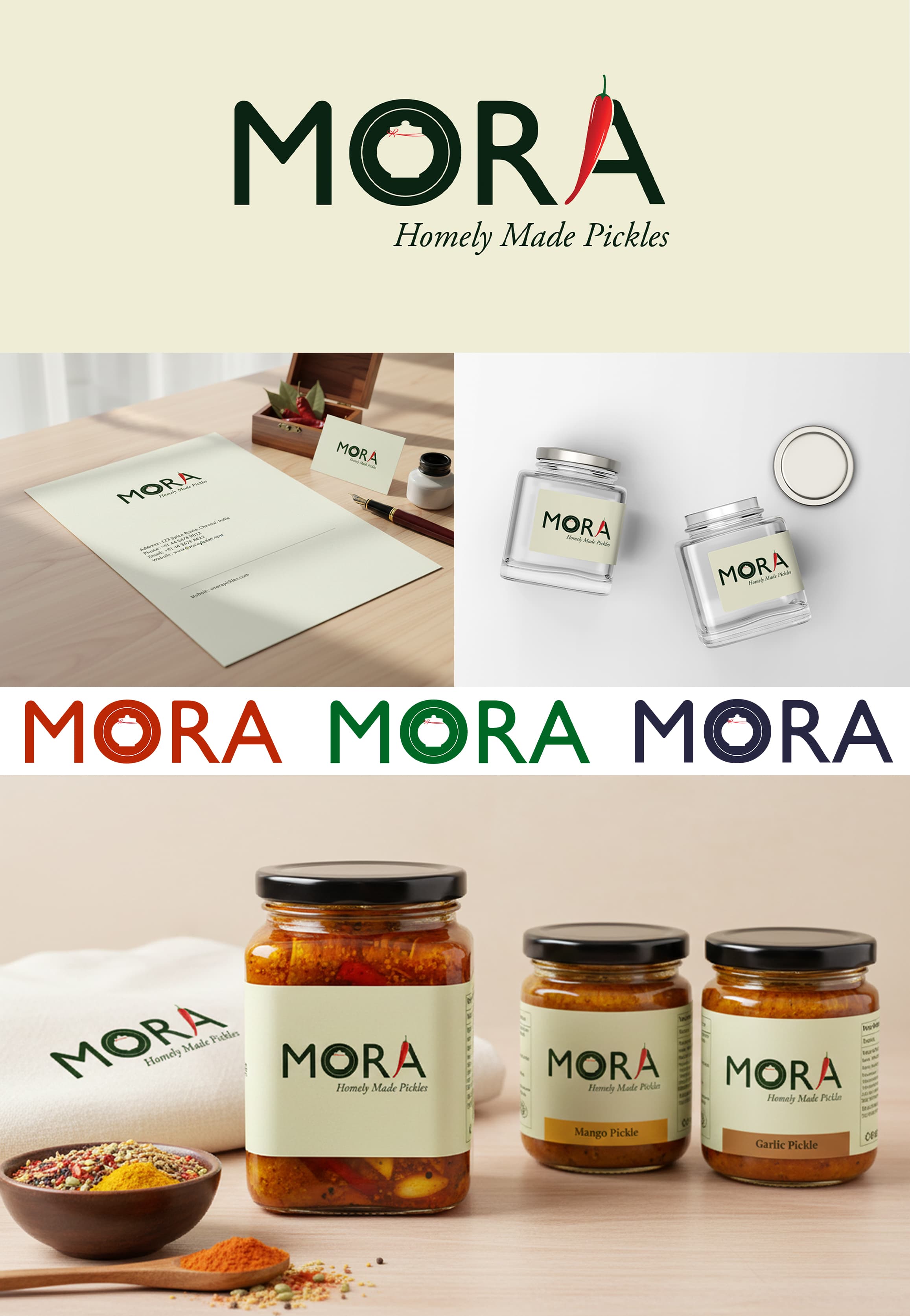
The Story
The story of MORA begins not just as a business, but as a tribute. The brand name itself is meaningful, woven from the names of the client's parents.
When the client, Nithin, approached the project, the mission was clear: create a brand for a Pickle Company that is purely Homely Made. The logo needed to honor traditional Indian roots.
Brand Requirements
Homely Made
Traditional Indian
Spicy Look
The Process
The design process started with a search for simplicity. To ensure the brand felt modern and accessible, the typeface Segoe UI was selected. It provided a clean, clear canvas that wouldn't distract from the cultural symbols soon to be added.
In Adobe Illustrator, I played with the font to create a custom feel. But a font alone isn't a story. To give it the "Traditional Indian Touch" as requested by the client, two specific cultural icons were integrated.
The 'Jaadi'
Inside the letter 'O', a silhouette of a traditional Kerala pickle jar also known as Jaadi was placed. It keeps the authenticity.
The Spice Factor
As requested by the client to give it a "spicy look," a vibrant red chili was used to form the stem of the letter 'A'.
Brand Application
The Conclusion
MORA stands as more than a label. It is a visual bridge between a family's heritage and the traditional flavors of Kerala. The brand identity captures the essence of homemade authenticity, honoring both the client's parents and the rich culinary traditions of India.